Last week, I built my first Finite State Machine in Akka with Java. I’ve done it before with Scala, and built/tested “plain ol'” actor systems in Akka with Java, but this was the first time I used Akka in Java for FSMs, and the first Akka project in the past ~2 yrs. The API has been updated, but not all of the docs had been updated. Thus, I had a heck of a time figuring out how to set up my test kit– most people are using Scala with Akka, which means the most accessible code samples are in Scala. This doesn’t help when the Java docs are wrong too 🙁
Here’s the Java API:
https://doc.akka.io/japi/akka/current/akka/testkit/TestFSMRef.html
The (Scala) example in that doc shows you can create a TestFSMRef directly with new(). Apparently you can do that with Scala, but in Java you need to call create().
Here’s an example. I have 2 FSMs defined elsewhere, YahtzeeFSM and PlayerFSM.
private void setUpTheGameFSM() {
   // Create a Game
   final Props props = Props.create(YahtzeeFsm.class, 2, 3);
   TestActorRef gameRef = TestFSMRef.create(system, props, "TheGame");
   ActorRef game = gameRef.underlyingActor();

   // Create a Player to send messages to the Game
   final Props playerProps = Props.create(PlayerFsm.class, gameRef, null, "Player1");
   TestActorRef playerActorRef = TestFSMRef.create(system, playerProps, "ThePlayer");
   ActorRef player = playerActorRef.underlyingActor();

}
There’s another weird thing. TestFSMRef.create() doesn’t return an instance of TestFSMRef; it returns an instance of TestActorRef. This makes it difficult when you want to use the TestFSMRef methods such as setState() (super useful when testing an FSM).
No big deal: clearly gameRef is actually a TestFSMRef, since it was created with TestFSMRef, right? Surely we can just cast it to a TestFSMRef. Oddly, this worked for a little bit, but then stopped working. I’m not quite sure why sometimes I can cast the ref to a TestFSMRef and sometimes I can’t.
Over the years of working at startups with some kind of location data and modeling of that data, one problem I routinely run into is how to understand the role of geography in the performance of a model I’ve created. That is, is my model better for some locations than others, and which locations? Initially, working primarily in Python or R, I’d iteratively select some data that was in a location I cared about, then reviewed the model performance on that subset. Or, I’d use the model predictions to select a subset of locations, and plot those on a map. In any case, it was a tedious and time consuming process.
However, it turns out that Tableau has a lovely feature to support this interactive data analysis. In Tableau, it’s called highlighting and filtering, but in more traditional Info Vis and Visual Analytic circles it’s called brushing and linking.
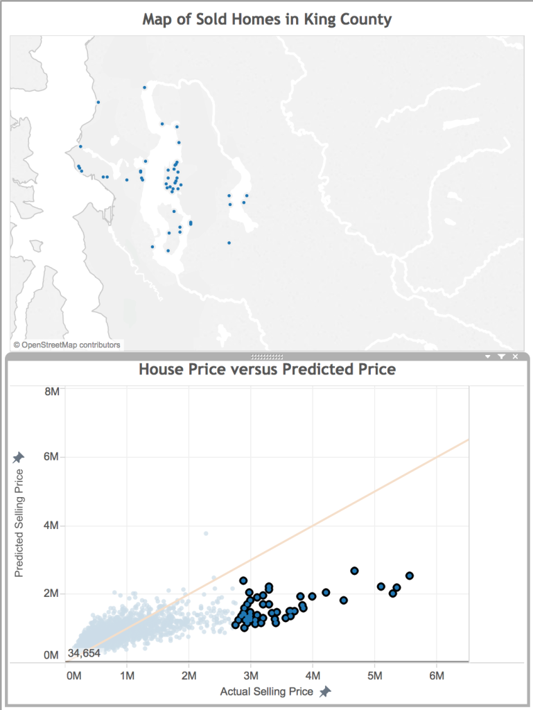
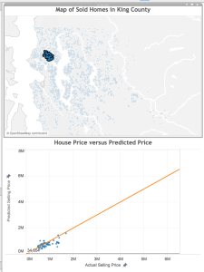
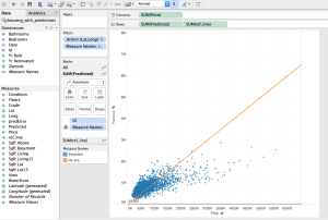
To give an example of how brushing and linking helps me to understand a predictive model, I’m going to use some home pricing data from here in King County. In this scenario, I have a model that predicts the price of a home given the square footage of the home. To better understand the model, where it works well, and where it fails, I want to identify some of the homes that the model did a good prediction on, and some that it did not do so well. This will help me better interpret the results, as well as identify an approach to improve the predictions. Understanding the model performance is important for both data scientists or analysts interested in improving the model, or for business decision makers who need to understand the limits of the information.
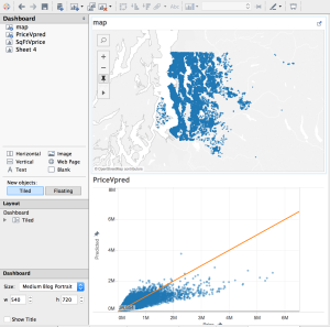
Below, you see a dashboard with the homes mapped on top, and the predictions on the bottom. By linking the data, when I select on a home in one visualization, both views are filtered to show the information for that home. By brushing the data, when I mouse over a data point in one view, that point is highlighted in the other views.
[Side note: To lasso-select an arbitrary shape on the scatterplot, hover your mouse over the chart, then over arrow in the upper-left corner, and select the lasso that pops up]
What’s happening with all these bad predictions?
When trying to improve a predictive model, one of the first things you ask yourself is “what do all of these data points with bad predictions have in common?”. With my linked view above, I can use the lasso selector to select just the poorly predicted points. I’m starting with the really bad predictions– the very expensive properties.
One of the things that immediately pops out is that many of these homes are on the shore of a water body. They likely have water access and great views, two features I may want to include in my model.
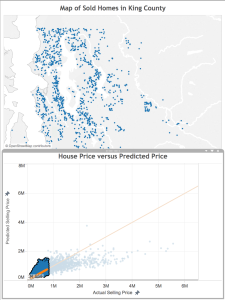
What about the lower priced bad predictions?
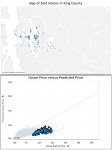
Next, I select and look at the poor predictions that are closer to the line.
Here, there error isn’t quite as great as in the case above, but once again we see that these houses that our model under-valued are close to water. Also, there are some clusters that appear to represent some neighborhoods: Mercer Island, Medina (where Microsoft founder Bill Gates lives), Laurelhurst, and Madison Park (where Starbucks CEO Howard Schulz lives). These are known to be more desirable neighborhoods in King County, so perhaps a notion of “desirable neighborhood” should be a feature in the final model.
What homes are sold for less than predicted?
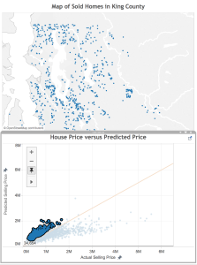
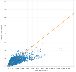
Okay, now that we know how the model is under-valuing, where is it over-valuing? This time, I select the homes above the orange line.
Consistent with what we saw above, these homes are located away from the shore. There also appear to be fewer homes in the urban core of Seattle and Bellevue– they are more in the suburbs or rural areas of the county.
Finding homes with good predictions
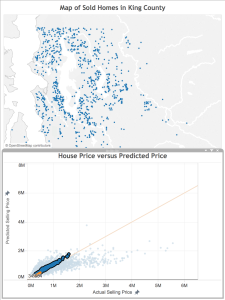
Finally, let’s look at the homes the model did a good job of predicting. I select the points closest to the orange line, and see the results on the map. Again, it’s consistent with what we saw above, which is great! There are more homes overall, not so close to the shore, still not so many in the urban core of the cities, but not so many rural properties (proportionally). This means that the additional features we identified already are probably enough.
Answering specific questions
Now, I’ve done the analysis I needed to do to understand my model performance (and I have a great list of new features to try!), but while I’m engaged with the data, I have to answer two more questions: First, what does the data look like in my neighborhood? Second, where are the houses I can afford (to be fair, the model has nothing to do with answering this question– this dashboard just provides a simple way to filter!). I won’t go into details about either, but will include the maps below, in case you’re also curious:
The Next Step: Improving the Model
This analysis helped me identify four potential features to include in my model to improve the performance:
Near the shore
Has a view
Neighborhood (or neighborhood desirability)
Distance from urban core (or perhaps something related, like population density)
My next step will be to include these features into my model. A future post will report on the resulting improvement–stay tuned!
Lastly, I need to stress how fast and easy it was to feel confident about this final analysis of the model! Tableau makes it very easy to pull in the data, drop it on a map, and start playing with it. Selecting data points visually rather than by lines of code with hard cutoffs to evaluate saved time, and I’m not concerned that I missed an important aspect of the analysis overall.
Questions? Comments? Suggestions?
As always, please feel free to leave a comment with any questions or suggestions. I’d love to hear about other ways you use interactive visualization to understand your model performance.
Each kind of visualization is designed to communicate a specific aspect of data, and each has it’s own strengths and weaknesses. However, when working with highly dimensional data, it can be difficult to decide on the best visualization to understand and communicate about your data.
How to solve this problem? Create all of the visualizations! But link them together, so that when you see manipulate one view, another view is updated with a related view of the same data. This is very simple to do in Tableau.
A small aside: “Brushing and linking” is the same as “Highlighting and filtering” in Tableau-speak. Brushing and linking are terms that are more traditional, and possibly academic. You can read more about it at the Info Vis Wiki. Brushing causes data highlighted in one view to highlight the same data in another view. Linking is selecting a subset of data in one view, which propagates to other views.
For a concrete example, I’m going to use some home pricing data from here in King County. In this scenario, I have a model that predicts the price of a home given the square footage of the home. To better understand the model, where it works well, and where it fails, I want to identify some of the homes that the model did a good prediction on, and some that it did not do so well. This will help me better interpret the results. Understanding the model performance is important for both data scientists or analysts interested in improving the model, or for business decision makers who need to understand the limits of the information.
First, I plot the actual price of the home versus the predicted price of the home. Here, anything below the orange line are examples where the model under-values, while anything above the orange line the model over-values. A perfect prediction is right on the line.
Perhaps I suspect geography has something to do with the quality of the predictions. In fact, one way to address this suspicion would be to plot the error of the prediction on a map and observe the patterns. But, maybe I’m also interested is considering different geographic hypotheses about how the model performs. I don’t want to generate a new set of visualizations for each hypothesis. This is where brushing and linking come in: these techniques allow me to perform an interactive visual analysis to support my hypothesis generation.
Below, you see a dashboard with the homes mapped on top, and the predictions on the bottom. By linking the data, when I select on a home in one visualization, both views are filtered to show the information for that home. By brushing the data, when I mouse over a data point in one view, that point is highlighted in the other views.
Implementing Linking and Brushing in Tableau
Tableau makes it very easy to implement linking and brushing. To start, create a new workbook and load in your data. This example is using a map and scatterplot, so we need data with latitude and longitudinal data. You can apply this technique to any kinds of visualizations, however.
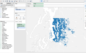
Create the map view. You have a lot of flexibility with your map, but there’s one important item: Make sure to have some sort of ID associated with the map, even if it’s not displayed. Notice ‘Id’ on the Marks shelf. This is what is used to filter the map points from the other view.
Create the scatterplot view. There are two important things to keep in mind on this view:
Set your Axes to “Fixed”. This prevents scaling issues when the points are filtered.
Make sure to have the ‘Id’ you identified in the previous step (again, even if it’s not displayed). This is how the two views are filtered.
Create a new dashboard.
Add the map to the dashboard.
Add the scatterplot to the dashboard.
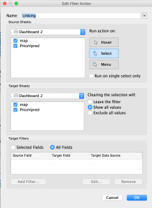
Add the linking:
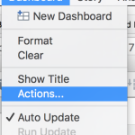
Go to Dashboard -> Actions.
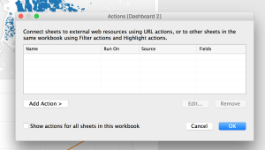
Click the Add Action button. Choose Filter.
Name it “Linking” (or whatever you want). Make sure “Select” is selected. Make sure all visualizations are listed in the boxes. Click OK.
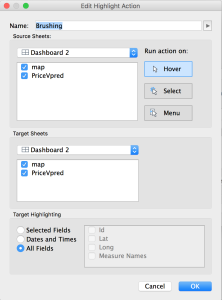
Add the brushing:
From the Actions window for the dashboard, click Add Action and choose Highlight.
Name it “Linking” (or whatever you like). Make sure the “Hover” is selected, and that all visualizations are listed in the boxes. (The defaults should be fine here; it’s the “Run Action On” piece you really need to look at). Click OK.
This is the final Actions list for this dashboard. You have linking and brushing! Click OK, and test it out.
Common Problems
I noted this above, but there are two common problems that could prevent this from working perfectly. First, make sure your axes are “Fixed” on any scatterplots; otherwise, every time you filter the data, the axes will change, and it will be difficult to interpret. Second, make sure you have an ID of some kind in each visualization; this is how the points get highlighted and filtered. If the highlighting isn’t working, check this first.
Questions? Comments? Suggestions?
As always, please feel free to leave a comment with any questions or suggestions. Also, share links to examples showing off your linking and brushing!
I’ve been working improving my data visualization skills. I also happened to pick up Christian Rudder’s Dataclysm again recently. In it, he talks about how he is intentional about the design of his data visualizations and that he is inspired by Edward Tufte. I admired some of the charts, and thought I’d learn something by attempting to copy the charts that he created. I find myself frequently explaining to my son that the first step of learning something new (in art, writing, whatever) is to attempt to copy what someone else is doing, in the process learning new skills, and then building on it, learning your own style and preferences in the process. Plus, I want to build my chart manipulation skills. My imagination is partly limited by the way I know how to do things, and what I know is possible. Trying to build something someone else imagined pushes my skills.
So here we are.
The chart is displaying a woman’s age versus the age of the men who look best to her. That is, the age of the men she’s most attracted to. Presumably, humans are attracted to people who are about the same age as themselves.
General Approach
I’m going to use ggplot2 to create the charts. I’ll start with a basic plot, then build it up from there. Once the structure is right, I’ll start taking away graphical elements.
Step by Step
I’ve put some data in a .csv (which I’m not going to share here, because that’s a little too close to stealing. I’ll revisit that later if anyone cares.), then read it into a dataframe. As you see, this is just a simple 2 column dataframe with the data.
To start with, I’ll need a base plot to build from. The woman’s age is along the y-axis, with the man’s age along the x. The labels are for the points on the chart. One of Tufte’s principles is to have each pixel of information be meaningful. It’s frequently helpful to have text labels on your plot than blobs of color; specifying the labels helps us do that in the next step.
A typical first step I might take with this data is to create a scatterplot to understand what’s going on:
plot + geom_point()
Now, Rudder’s original plot was basically a table. I skipped that step. But what that plot had that mine doesn’t is the following:
The y-axis had all ages, in black.
The y-axis was increasing going down.
The labels were red.
It had a title.
We can add those items to the base plot to build up the chart:
plot <- plot +
  geom_text(color = 'red', size = 3) +
  scale_y_reverse(breaks = seq(20, 50, 1)) +
  theme(axis.text.y = element_text(color = 'black')) +
  ggtitle("a woman's age vs the age of the men who look best to her")

print(plot)
We’re getting there. Now, let’s add a line indicating our ‘assumption’, that humans are attracted to people the same age as them.
You’ll see that we need to be specific about the x-axis as well as the y-axis, to see the data we want to see.
Now, there are 2 things left to do: Remove the gray shading in the background and the axis labels, and format the title. With ggplot2, theme() is used to format any non-data element. Since we want to remove almost everything, we set each of the non-data elements we want gone to ‘element_blank()’.
final_plot <- ggplot(data = df,
                     aes(x = age.of.man.who.looks.best,
                         y = womans.age,
                         label = age.of.man.who.looks.best))

final_plot <- final_plot +
  geom_abline(linetype = 'dashed', intercept = 0, slope = -1) +
  geom_text(color = 'red', size = 4) +
  scale_y_reverse(breaks = seq(20, 50, 1)) +
  theme(axis.text.y = element_text(color = 'black')) +
  ggtitle("a woman's age vs the age of the men who look best to her") +
  xlim(20, 50) +
  theme(axis.ticks = element_blank(),
        axis.title = element_blank(),
        axis.ticks.x = element_blank(),
        axis.text.x = element_blank(),
        panel.background = element_blank(),
        panel.grid = element_blank(),
        plot.title = element_text(hjust = 0,
                                  face = 'italic'),
        text = element_text(size = 12),
        title = element_text(size = 12))

print(final_plot)
Okay, let’s save it to file for the future. I have to admit, I always struggle when getting the dimensions right on the png call such that the plot actually looks like what is coming up on screen. To get these parameters, I used a trial and error process. When I’m rushed for time I’ll just save as PNG from the RStudio interface, but I prefer to get it right and print directly to the device driver. This helps for future reproducibility as well. If I save from the interface, I can’t remember anything when I come back to recreate either the same or a similar plot later.
I can’t figure out how to make the title multi-colored. Rudder has his title colored, with the “age of the men who look best to her” in red, to match the color of the men’s ages in the plot. This is important, because Rudder uses the title as a legend. If anyone knows, please leave it in the comments, and I’ll update.
Design Elements: Tufte’s Influence
I mentioned at the beginning that Rudder designed his charts with Tufte’s recommendations in mind. Here’s how I see the influence in this plot:
Data-Ink. Tufte recommends that the proportion of ink used to display data to ink used to print the graphic should be close to 1. That is, there should be little ink on the plot that doesn’t explicitly display a data point. In fact, Tufte recommends a practice of iteratively removing more graphical ink from the plot over and over, to really discover that point where too much data ink has been removed.
Multi-Functioning Graphical Elements. An basic approach to displaying this data may be a scatterplot, with or without an accompanying label. However, with the scatterplot approach, you need more non-data-ink to interpret the dots, such as grid lines and axis labels. Here, Rudder has used the labels as the data points, which allows him to remove the grid lines and axis labels, yet doesn’t reduce the legibility or understandability of the chart. Additionally, he uses the title as a legend, as a way to reduce both non-data-ink and make the title a multi-functioning element.
I loved this experiment, and taking the time to really appreciate Rudder’s plots and figure out how to produce them. However, I have to admit, in most of my day to day work this kind of attention to detail to create a simple, beautiful chart like this is not a high priority. To get something this elegant that still works takes time. Also, it’s different, so someone has to think to understand it. A more typical bar chart or scatterplot (preferably in a Microsoft format) is familiar, so they don’t have to think so much to interpret it. While I can’t currently apply this in my job, I appreciate the knowledge and hope to be able to some point in the future.