I’ve been working improving my data visualization skills. I also happened to pick up Christian Rudder’s Dataclysm again recently. In it, he talks about how he is intentional about the design of his data visualizations and that he is inspired by Edward Tufte. I admired some of the charts, and thought I’d learn something by attempting to copy the charts that he created. I find myself frequently explaining to my son that the first step of learning something new (in art, writing, whatever) is to attempt to copy what someone else is doing, in the process learning new skills, and then building on it, learning your own style and preferences in the process. Plus, I want to build my chart manipulation skills. My imagination is partly limited by the way I know how to do things, and what I know is possible. Trying to build something someone else imagined pushes my skills.
So here we are.
The chart is displaying a woman’s age versus the age of the men who look best to her. That is, the age of the men she’s most attracted to. Presumably, humans are attracted to people who are about the same age as themselves.
General Approach
I’m going to use ggplot2 to create the charts. I’ll start with a basic plot, then build it up from there. Once the structure is right, I’ll start taking away graphical elements.
Step by Step
I’ve put some data in a .csv (which I’m not going to share here, because that’s a little too close to stealing. I’ll revisit that later if anyone cares.), then read it into a dataframe. As you see, this is just a simple 2 column dataframe with the data.
df <- read.csv(data_file)
head(df)
## womans.age age.of.man.who.looks.best
## 1 20 23
## 2 21 23
## 3 22 24
## 4 23 25
## 5 24 25
## 6 25 26
To start with, I’ll need a base plot to build from. The woman’s age is along the y-axis, with the man’s age along the x. The labels are for the points on the chart. One of Tufte’s principles is to have each pixel of information be meaningful. It’s frequently helpful to have text labels on your plot than blobs of color; specifying the labels helps us do that in the next step.
plot <- ggplot(data = df,
               aes(x = age.of.man.who.looks.best,
               y = womans.age,
               label = age.of.man.who.looks.best))
Now that I have the base plot, I can build it up.
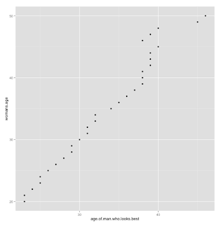
A typical first step I might take with this data is to create a scatterplot to understand what’s going on:
plot + geom_point()Now, Rudder’s original plot was basically a table. I skipped that step. But what that plot had that mine doesn’t is the following:
- The y-axis had all ages, in black.
- The y-axis was increasing going down.
- The labels were red.
- It had a title.
We can add those items to the base plot to build up the chart:
plot <- plot +
  geom_text(color = 'red', size = 3) +
  scale_y_reverse(breaks = seq(20, 50, 1)) +
  theme(axis.text.y = element_text(color = 'black')) +
  ggtitle("a woman's age vs the age of the men who look best to her")

print(plot)
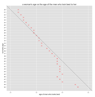
We’re getting there. Now, let’s add a line indicating our ‘assumption’, that humans are attracted to people the same age as them.
plot <- plot +
  xlim(20, 50) +
  geom_abline(linetype = 'dashed', intercept = 0, slope = -1)

print(plot)
You’ll see that we need to be specific about the x-axis as well as the y-axis, to see the data we want to see.
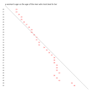
Now, there are 2 things left to do: Remove the gray shading in the background and the axis labels, and format the title. With ggplot2, theme() is used to format any non-data element. Since we want to remove almost everything, we set each of the non-data elements we want gone to ‘element_blank()’.
plot <- plot +
  theme(axis.ticks = element_blank(),
        axis.title = element_blank(),
        axis.ticks.x = element_blank(),
        axis.text.x = element_blank(),
        panel.background = element_blank(),
        panel.grid = element_blank(),
        plot.title = element_text(hjust = 0,
                                  face = 'italic'))


print(plot)
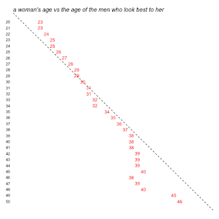
Now, let’s put it all in one place:
final_plot <- ggplot(data = df,
                     aes(x = age.of.man.who.looks.best,
                         y = womans.age,
                         label = age.of.man.who.looks.best))

final_plot <- final_plot +
  geom_abline(linetype = 'dashed', intercept = 0, slope = -1) +
  geom_text(color = 'red', size = 4) +
  scale_y_reverse(breaks = seq(20, 50, 1)) +
  theme(axis.text.y = element_text(color = 'black')) +
  ggtitle("a woman's age vs the age of the men who look best to her") +
  xlim(20, 50) +
  theme(axis.ticks = element_blank(),
        axis.title = element_blank(),
        axis.ticks.x = element_blank(),
        axis.text.x = element_blank(),
        panel.background = element_blank(),
        panel.grid = element_blank(),
        plot.title = element_text(hjust = 0,
                                  face = 'italic'),
        text = element_text(size = 12),
        title = element_text(size = 12))

print(final_plot)
Okay, let’s save it to file for the future. I have to admit, I always struggle when getting the dimensions right on the png call such that the plot actually looks like what is coming up on screen. To get these parameters, I used a trial and error process. When I’m rushed for time I’ll just save as PNG from the RStudio interface, but I prefer to get it right and print directly to the device driver. This helps for future reproducibility as well. If I save from the interface, I can’t remember anything when I come back to recreate either the same or a similar plot later.
png(filename="women_v_men.png",
    width=600,
    height=600,
    res=80)

print(final_plot)
dev.off()
One thing is still missing: Multi-colored title.
I can’t figure out how to make the title multi-colored. Rudder has his title colored, with the “age of the men who look best to her” in red, to match the color of the men’s ages in the plot. This is important, because Rudder uses the title as a legend. If anyone knows, please leave it in the comments, and I’ll update.
Design Elements: Tufte’s Influence
I mentioned at the beginning that Rudder designed his charts with Tufte’s recommendations in mind. Here’s how I see the influence in this plot:
- Data-Ink. Tufte recommends that the proportion of ink used to display data to ink used to print the graphic should be close to 1. That is, there should be little ink on the plot that doesn’t explicitly display a data point. In fact, Tufte recommends a practice of iteratively removing more graphical ink from the plot over and over, to really discover that point where too much data ink has been removed.
- Multi-Functioning Graphical Elements. An basic approach to displaying this data may be a scatterplot, with or without an accompanying label. However, with the scatterplot approach, you need more non-data-ink to interpret the dots, such as grid lines and axis labels. Here, Rudder has used the labels as the data points, which allows him to remove the grid lines and axis labels, yet doesn’t reduce the legibility or understandability of the chart. Additionally, he uses the title as a legend, as a way to reduce both non-data-ink and make the title a multi-functioning element.
I loved this experiment, and taking the time to really appreciate Rudder’s plots and figure out how to produce them. However, I have to admit, in most of my day to day work this kind of attention to detail to create a simple, beautiful chart like this is not a high priority. To get something this elegant that still works takes time. Also, it’s different, so someone has to think to understand it. A more typical bar chart or scatterplot (preferably in a Microsoft format) is familiar, so they don’t have to think so much to interpret it. While I can’t currently apply this in my job, I appreciate the knowledge and hope to be able to some point in the future.


