Each kind of visualization is designed to communicate a specific aspect of data, and each has it’s own strengths and weaknesses. However, when working with highly dimensional data, it can be difficult to decide on the best visualization to understand and communicate about your data.
How to solve this problem? Create all of the visualizations! But link them together, so that when you see manipulate one view, another view is updated with a related view of the same data. This is very simple to do in Tableau.
A small aside: “Brushing and linking” is the same as “Highlighting and filtering” in Tableau-speak. Brushing and linking are terms that are more traditional, and possibly academic. You can read more about it at the Info Vis Wiki. Brushing causes data highlighted in one view to highlight the same data in another view. Linking is selecting a subset of data in one view, which propagates to other views.
For a concrete example, I’m going to use some home pricing data from here in King County. In this scenario, I have a model that predicts the price of a home given the square footage of the home. To better understand the model, where it works well, and where it fails, I want to identify some of the homes that the model did a good prediction on, and some that it did not do so well. This will help me better interpret the results. Understanding the model performance is important for both data scientists or analysts interested in improving the model, or for business decision makers who need to understand the limits of the information.
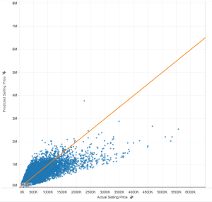
First, I plot the actual price of the home versus the predicted price of the home. Here, anything below the orange line are examples where the model under-values, while anything above the orange line the model over-values. A perfect prediction is right on the line.
Perhaps I suspect geography has something to do with the quality of the predictions. In fact, one way to address this suspicion would be to plot the error of the prediction on a map and observe the patterns. But, maybe I’m also interested is considering different geographic hypotheses about how the model performs. I don’t want to generate a new set of visualizations for each hypothesis. This is where brushing and linking come in: these techniques allow me to perform an interactive visual analysis to support my hypothesis generation.
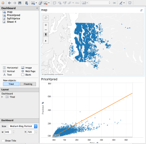
Below, you see a dashboard with the homes mapped on top, and the predictions on the bottom. By linking the data, when I select on a home in one visualization, both views are filtered to show the information for that home. By brushing the data, when I mouse over a data point in one view, that point is highlighted in the other views.
Implementing Linking and Brushing in Tableau
Tableau makes it very easy to implement linking and brushing. To start, create a new workbook and load in your data. This example is using a map and scatterplot, so we need data with latitude and longitudinal data. You can apply this technique to any kinds of visualizations, however.
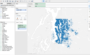
- Create the map view. You have a lot of flexibility with your map, but there’s one important item: Make sure to have some sort of ID associated with the map, even if it’s not displayed. Notice ‘Id’ on the Marks shelf. This is what is used to filter the map points from the other view.
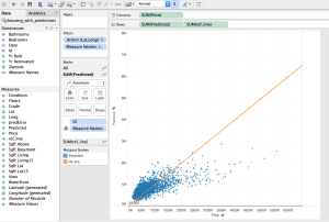
- Create the scatterplot view. There are two important things to keep in mind on this view:
- Set your Axes to “Fixed”. This prevents scaling issues when the points are filtered.
- Make sure to have the ‘Id’ you identified in the previous step (again, even if it’s not displayed). This is how the two views are filtered.
- Create a new dashboard.
- Add the map to the dashboard.
- Add the scatterplot to the dashboard.
- Add the linking:
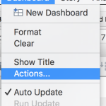
- Go to Dashboard -> Actions.
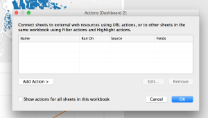
- Click the Add Action button. Choose Filter.
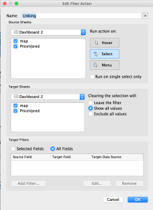
- Name it “Linking” (or whatever you want). Make sure “Select” is selected. Make sure all visualizations are listed in the boxes. Click OK.
- Go to Dashboard -> Actions.
- Add the brushing:
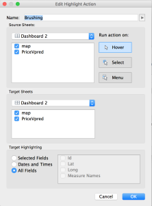
- From the Actions window for the dashboard, click Add Action and choose Highlight.
- Name it “Linking” (or whatever you like). Make sure the “Hover” is selected, and that all visualizations are listed in the boxes. (The defaults should be fine here; it’s the “Run Action On” piece you really need to look at). Click OK.
- This is the final Actions list for this dashboard. You have linking and brushing! Click OK, and test it out.

Common Problems
I noted this above, but there are two common problems that could prevent this from working perfectly. First, make sure your axes are “Fixed” on any scatterplots; otherwise, every time you filter the data, the axes will change, and it will be difficult to interpret. Second, make sure you have an ID of some kind in each visualization; this is how the points get highlighted and filtered. If the highlighting isn’t working, check this first.
Questions? Comments? Suggestions?
As always, please feel free to leave a comment with any questions or suggestions. Also, share links to examples showing off your linking and brushing!
Good afternoon
I would like to connect a specific point on the map to a dashboard. It’s possible?