Over the years of working at startups with some kind of location data and modeling of that data, one problem I routinely run into is how to understand the role of geography in the performance of a model I’ve created. That is, is my model better for some locations than others, and which locations? Initially, working primarily in Python or R, I’d iteratively select some data that was in a location I cared about, then reviewed the model performance on that subset. Or, I’d use the model predictions to select a subset of locations, and plot those on a map. In any case, it was a tedious and time consuming process.
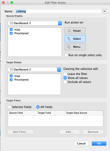
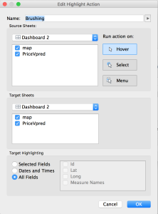
However, it turns out that Tableau has a lovely feature to support this interactive data analysis. In Tableau, it’s called highlighting and filtering, but in more traditional Info Vis and Visual Analytic circles it’s called brushing and linking.
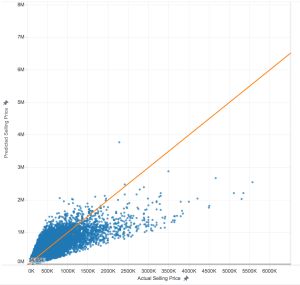
To give an example of how brushing and linking helps me to understand a predictive model, I’m going to use some home pricing data from here in King County. In this scenario, I have a model that predicts the price of a home given the square footage of the home. To better understand the model, where it works well, and where it fails, I want to identify some of the homes that the model did a good prediction on, and some that it did not do so well. This will help me better interpret the results, as well as identify an approach to improve the predictions. Understanding the model performance is important for both data scientists or analysts interested in improving the model, or for business decision makers who need to understand the limits of the information.
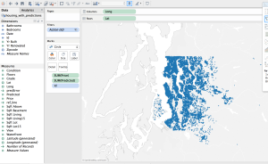
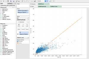
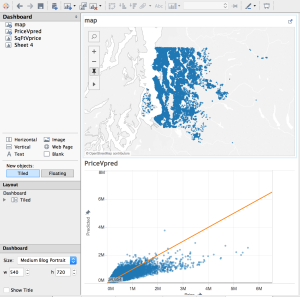
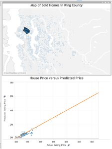
Below, you see a dashboard with the homes mapped on top, and the predictions on the bottom. By linking the data, when I select on a home in one visualization, both views are filtered to show the information for that home. By brushing the data, when I mouse over a data point in one view, that point is highlighted in the other views.
[Side note: To lasso-select an arbitrary shape on the scatterplot, hover your mouse over the chart, then over arrow in the upper-left corner, and select the lasso that pops up]
What’s happening with all these bad predictions?
When trying to improve a predictive model, one of the first things you ask yourself is “what do all of these data points with bad predictions have in common?”. With my linked view above, I can use the lasso selector to select just the poorly predicted points. I’m starting with the really bad predictions– the very expensive properties.
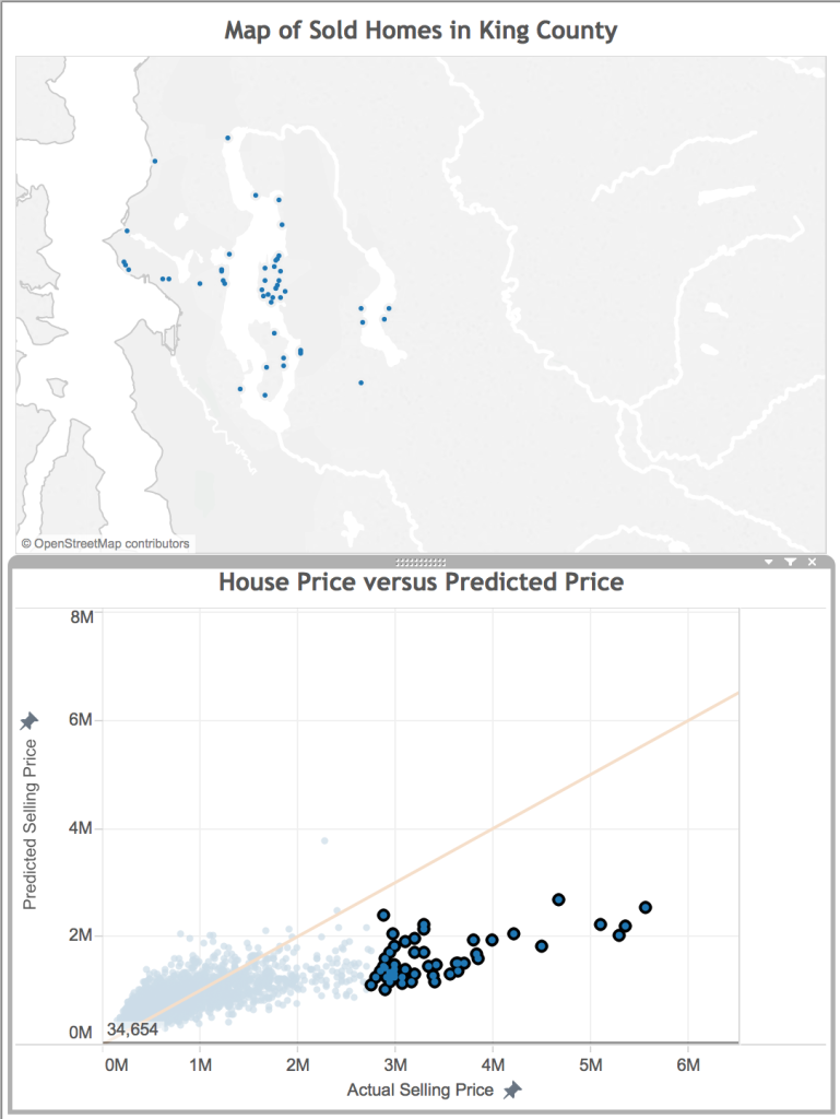
One of the things that immediately pops out is that many of these homes are on the shore of a water body. They likely have water access and great views, two features I may want to include in my model.
What about the lower priced bad predictions?
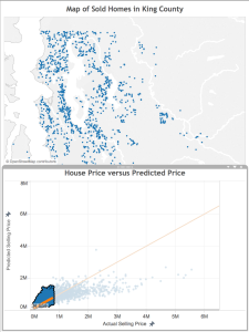
Next, I select and look at the poor predictions that are closer to the line.
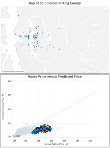
Here, there error isn’t quite as great as in the case above, but once again we see that these houses that our model under-valued are close to water. Also, there are some clusters that appear to represent some neighborhoods: Mercer Island, Medina (where Microsoft founder Bill Gates lives), Laurelhurst, and Madison Park (where Starbucks CEO Howard Schulz lives). These are known to be more desirable neighborhoods in King County, so perhaps a notion of “desirable neighborhood” should be a feature in the final model.
What homes are sold for less than predicted?
Okay, now that we know how the model is under-valuing, where is it over-valuing? This time, I select the homes above the orange line.
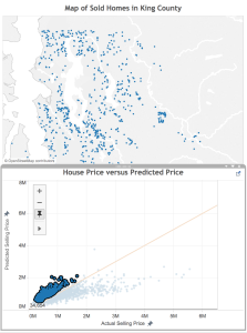
Consistent with what we saw above, these homes are located away from the shore. There also appear to be fewer homes in the urban core of Seattle and Bellevue– they are more in the suburbs or rural areas of the county.
Finding homes with good predictions
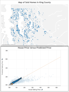 Finally, let’s look at the homes the model did a good job of predicting. I select the points closest to the orange line, and see the results on the map. Again, it’s consistent with what we saw above, which is great! There are more homes overall, not so close to the shore, still not so many in the urban core of the cities, but not so many rural properties (proportionally). This means that the additional features we identified already are probably enough.
Answering specific questions
Now, I’ve done the analysis I needed to do to understand my model performance (and I have a great list of new features to try!), but while I’m engaged with the data, I have to answer two more questions: First, what does the data look like in my neighborhood? Second, where are the houses I can afford (to be fair, the model has nothing to do with answering this question– this dashboard just provides a simple way to filter!). I won’t go into details about either, but will include the maps below, in case you’re also curious:
The Next Step: Improving the Model
This analysis helped me identify four potential features to include in my model to improve the performance:
- Near the shore
- Has a view
- Neighborhood (or neighborhood desirability)
- Distance from urban core (or perhaps something related, like population density)
My next step will be to include these features into my model. A future post will report on the resulting improvement–stay tuned!
Lastly, I need to stress how fast and easy it was to feel confident about this final analysis of the model! Tableau makes it very easy to pull in the data, drop it on a map, and start playing with it. Selecting data points visually rather than by lines of code with hard cutoffs to evaluate saved time, and I’m not concerned that I missed an important aspect of the analysis overall.
Questions? Comments? Suggestions?
As always, please feel free to leave a comment with any questions or suggestions. I’d love to hear about other ways you use interactive visualization to understand your model performance.